Tuesday, October 25, 2011

Typography Scene

Sketch 

Day 2

Day 3
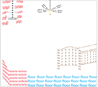
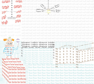
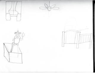
This assignment was pretty easy but yet required a lot of thinking. I was expected to create a a scene for my typobject by using the envelope tool, type tool, and pen tool in Adobe Illustrator. My final product is very coloroful. It consist of a  floor, crib ceiling fan, a box, the clown I used in the typography project, a diaper table, floor, wall, and window. I used the elements of art by using form,shape,color, and value. I used form by using the pen tool to create a cube for the clown to stand up on. I used shape by using squares to create the cube and the eclipse tool to create some parts of the fan. I used color by using red for the curtains and the box, brown for the crib , gray for the wall, black for the diaper table, blue for the floor, yellow for the fan bulb, and numerous colors  for the clown. I used value to change the opacity for the wall color and the floor. I used the Principles of Design by using proportion and repetition.  I made sure thr crib was the appropriate size so it could take up an amount of space same as for the box, window, fan, and clown. I used reptition by repeating the words "floor", "wall", and "box". My final design does not represent my sketch because I added a  diaper table to the scene and I didnt make the spring to make the clown look like it was popping out of the box.

Monday, October 17, 2011

Art Show

Sketch
Day 2

Day 3


Day 4
Day5


This assignment was pretty easy but kind of challenging since I had to come up with something and do it within a time limit . I was expected to produce a project for an art show using either Adobe Illustrator or Photoshop by using specific tools. My final product has a picture of a silhouette of a man in the bottom left corner telling different lies (hence the different usage of fonts for the word  "lies") , and the lies are breaking the heart. Within the heart, I used one of the most common lies told today which is " I Love You" by using .  For the background color I used a blue gradient. I used the Elements of Art by using space, shape, and color. I used space by spreading out the different lies and the picture of the man so it would collide. I used color by using a blue gradient for the background and the color red for the heart. I used shape by using the pen tool to create a broken heart  and the words " I love you" in to a broken hert shape by using the envelope tool. I used the Principles of  Design by using proportion and repetition. I used proportion by letting the picture of the man cover up the bottom left side of the document and the word "lies" spreaded out at the top. I used repetion by using the word "lies " and the phrase  " I love you" over again. My final design does't represent my sketch because I decided to switch it up and most people couldn't tell what the mouth was when I created it in Adobe Illustrator.

Friday, October 7, 2011

Zombify

Original

Day 1

Day 2

 This assignment was very easy and fun. I was expected to produce a Photoshop Document of me as a zomby by using specific tools in Photoshop CS3 such as the lasso and moving tool. My final project was a picture of me with green eyes with circles underneath, cracked skin, my teeth eroded, bloody hands printed on my hoodie, a scar going down the right side of my arm, and an eery bloody background. I used the Elements of Art by using texture and value. I used value by giving my overall picture a grayish look to give it that dead zombie feeling. I used texture by using an image of cracked  paint and blending it with my skin by using the darken tool and then multiplying it so it can give it that rough feeling. I used the Principles of Design by using repetition. I repeatedly used the cracked paint image to cover all proportions of my skin. I also reused some of the blood in my background and on my hoodie. My final design doesn't represent my sketch because a sketch was not required for this assignment.

Monday, October 3, 2011

TypeoObject


Sketch


sketch
Day 1


Day 3


Day 4
This assignment was pretty easy.I was expected to produce an 8.5 by 11 Adobe Illustrator CS3 document by creating an object by using typography, envelope distort option, and the pen tool . My final product was very neat and well designed. I created a clown by using the words of specific parts to create it. For example, when I created the hair I typed the words hair  and used the pen tool to trace the outline of my sketch of the hair. Then I used the envelope distort tool so it could warp the words hair into the hair shape. I used the Elements of Art by using shape and value. I used shape because in the photo the clown is holding a balloon I balloons are round so I used the ellipse tool and created a circle and typed balloon and used the envelope distort tool so the word "balloon" could be a balloon shape. I also used the ellipse tool for a circle  to create the nose. I used value because not all of the parts are the same color. For an example the clown may look black and white but for the dots on the costume, I changed the opacity level. I also did the same for the  makeup on the side of the mouth. I used the Principles of design by using balance so that my clown looks even, its not all slanted on the page. Everything is neat and in order. My final product represents my sketch because the both look the same if you were to hold it up together. The only difference is is that the balloon part is cut off on the sketch and I didn't add the tongue part to it.