Thursday, December 15, 2011
Monday, December 12, 2011
mySPACE
 |
| Sketch |
 |
| Day 2 |
 |
| Day 3 |
This project was kind of easy but took quite a thought. I was expected to create a 3-Demensional room for the lamp I created in the previous project by using specific tools in Adobe Illustrator. My final product is a bedroom with a green wall and puple floor with a mini flower carpet. I also have a dirt clothes hamper with clothes hanging out of it, a bed, poster on the wall, and a dresser. I used the Elements of Art by using texture shape color and value. I used texture by givin the table and headboards a grain look so that it would look like wood. I used shape by creating circles and rectangles and squares in or order for me to create the room. I also used the 3D effect by using bevel and emboss. I used color and value by using the colors green and purple for the wall and floor, brown for the headboard , night stand, and dresser, yellow and brown for the mini carpet, gray for the dirty clothes hamper, and numerous colors for the colors hanging out of it. I used value by creating a gradient for outside the window so that it would look like it was night time. I used the Principles of Design by using repetiton and balance. I used repetition by using various shapes over again. I used balance a lot in this project to make sure things weren't uneven in the room so it wouldn't look sloppy and that my work was neat.My final design doesn't represent my sketch because I moved a couple of thing around and changed a couple of thing slike the window and the mini flower carpet.
Tuesday, December 6, 2011
MyLAMP
 |
| Sketch |
This project wasn't difficult nor easy. I was expected to produce a lamp by using specific tools in Adobe Illustartor. My final product was a flower lamp. In order for you to use it you must press the button. My photo consists of a pink vase with two roses in it and light is reflecting out of it. I used the elements of art by using color,texture,shape,and value. I used texture by giving it the plastic look. I used color and value by creating a pink vase, green for the flower stem and and salmon kind of color for the rose. I used value by changing the opacity of the yellow so that it would look like the light was coming out of the lamp. I also used shape by using the 3D effect in Adobe Illustrator. I used the Principles of Design by using repetion and balance. I used repition by using the same flower over again. I used balance by turning the flower a little bit to the side. My final design doesnt represent my sketch because I only used two flowers instead of multiple ones
Monday, November 28, 2011
Emotions
 |
| Sketch |
 |
| Day 2 |
 |
| Day 3 |
 |
| Day 4 |

This project was a bit of a challenge . I was expected to create a symbol for an emotion, mine was fear, by using minimalism and specific tools in Adobe Illustrator . My final product is a hand in a hook shape with slime dripping on it and spiders in a web. It also has a drop shadow on it. I used the Elements of art by using shape,line,and value. I used shape by using the ellipse tool to create the circle around the hand and the spider's body . I used line to create the spiderweb and I used value by using the drop shadow tool to give the hand a a gray looking color and give it a shadow behind. I used the Principles of Design by using unity such as repetition. I repeatedly used spots of slime over the hand. My project doesn't represent my sketch because I added some changes to my project by adding spiders and their web to it.
Wednesday, November 16, 2011
Still Photo
 |
| Sketch |
 |
| Day 1 |
 |
| Day 2 |
 |
| Day 3 |
Thursday, November 10, 2011
Tessellation
 |
| Sketch |
 |
| Day 3 |
This project was kind of difficult to me. I was expected to create a tessellation design by using specific tools in Adobe Illustrator. My final design is a hexagon with with the design in the inside and the stars are suppose to look like they are popping out with the swirls on the side. It was supposed to feel/look like you were in a dream world. I used the Elements of Art by using line and color. I used line,shape, and color .I used line by using the line tool to create the kite within the hexagon so I can stick the design in it. I used color by using yellow for the star.I used shape by creating the polygon tool.I used the Principles of Design by using rhythm. The stars was supposed to look like it had an up and down motion throughout the tessellation. My sketch doesn't look like my sketch because I had some difficulties with the creating the dimensions.
Tuesday, November 1, 2011
Water Mark
 |
| Sketch |
 |
 |
| Day 2 |
This assignment was pretty easy. I was expected to produce a watermark that represents us for my future art projects by using the pen tool in Adobe Illustrator. My final product is a photo of a girl leaning on a wall holding a basketball wearing high heels. The girl is also wearing a letterman jacket with my nickname "Chizzle" going down the sleeve. I used the Elements of Art by using shape and color. I used shape by using the ellipse tool to create the basketball and and the rectangular tool to create the wall. I used color by using black to highlight specific parts such as the basketball, wall, and the sleeve of the jacket. I used the Principles of Design by using balance. I used balance by making sure the shoes were proportioned right so it can have that leaning affect. My sketch doesn't represent my final design because instead of using my initials "SBC" spinning on the hand I used a basketball since I play basketball. I also added an earring to the face and my nickname "Chizzle" on the sleeve.
Tuesday, October 25, 2011
Typography Scene
 |
| Sketch |
 |
| Day 2 |
 |
| Day 3 |
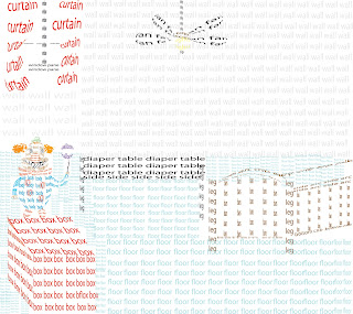
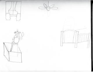
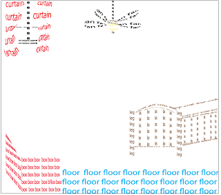
This assignment was pretty easy but yet required a lot of thinking. I was expected to create a a scene for my typobject by using the envelope tool, type tool, and pen tool in Adobe Illustrator. My final product is very coloroful. It consist of a floor, crib ceiling fan, a box, the clown I used in the typography project, a diaper table, floor, wall, and window. I used the elements of art by using form,shape,color, and value. I used form by using the pen tool to create a cube for the clown to stand up on. I used shape by using squares to create the cube and the eclipse tool to create some parts of the fan. I used color by using red for the curtains and the box, brown for the crib , gray for the wall, black for the diaper table, blue for the floor, yellow for the fan bulb, and numerous colors for the clown. I used value to change the opacity for the wall color and the floor. I used the Principles of Design by using proportion and repetition. I made sure thr crib was the appropriate size so it could take up an amount of space same as for the box, window, fan, and clown. I used reptition by repeating the words "floor", "wall", and "box". My final design does not represent my sketch because I added a diaper table to the scene and I didnt make the spring to make the clown look like it was popping out of the box.
Monday, October 17, 2011
Art Show
 |
| Sketch |
 |
| Day 2 |
 |
| Day 3 |
 |
| Day 4 |
 |
| Day5 |
This assignment was pretty easy but kind of challenging since I had to come up with something and do it within a time limit . I was expected to produce a project for an art show using either Adobe Illustrator or Photoshop by using specific tools. My final product has a picture of a silhouette of a man in the bottom left corner telling different lies (hence the different usage of fonts for the word "lies") , and the lies are breaking the heart. Within the heart, I used one of the most common lies told today which is " I Love You" by using . For the background color I used a blue gradient. I used the Elements of Art by using space, shape, and color. I used space by spreading out the different lies and the picture of the man so it would collide. I used color by using a blue gradient for the background and the color red for the heart. I used shape by using the pen tool to create a broken heart and the words " I love you" in to a broken hert shape by using the envelope tool. I used the Principles of Design by using proportion and repetition. I used proportion by letting the picture of the man cover up the bottom left side of the document and the word "lies" spreaded out at the top. I used repetion by using the word "lies " and the phrase " I love you" over again. My final design does't represent my sketch because I decided to switch it up and most people couldn't tell what the mouth was when I created it in Adobe Illustrator.
Friday, October 7, 2011
Zombify
 |
| Original |
 |
| Day 1 |
 |
This assignment was very easy and fun. I was expected to produce a Photoshop Document of me as a zomby by using specific tools in Photoshop CS3 such as the lasso and moving tool. My final project was a picture of me with green eyes with circles underneath, cracked skin, my teeth eroded, bloody hands printed on my hoodie, a scar going down the right side of my arm, and an eery bloody background. I used the Elements of Art by using texture and value. I used value by giving my overall picture a grayish look to give it that dead zombie feeling. I used texture by using an image of cracked paint and blending it with my skin by using the darken tool and then multiplying it so it can give it that rough feeling. I used the Principles of Design by using repetition. I repeatedly used the cracked paint image to cover all proportions of my skin. I also reused some of the blood in my background and on my hoodie. My final design doesn't represent my sketch because a sketch was not required for this assignment.
Monday, October 3, 2011
TypeoObject
 |
| Sketch |
 |
| sketch |
 |
| Day 1 |
 |
| Day 3 |
 |
| Day 4 |
This assignment was pretty easy.I was expected to produce an 8.5 by 11 Adobe Illustrator CS3 document by creating an object by using typography, envelope distort option, and the pen tool . My final product was very neat and well designed. I created a clown by using the words of specific parts to create it. For example, when I created the hair I typed the words hair and used the pen tool to trace the outline of my sketch of the hair. Then I used the envelope distort tool so it could warp the words hair into the hair shape. I used the Elements of Art by using shape and value. I used shape because in the photo the clown is holding a balloon I balloons are round so I used the ellipse tool and created a circle and typed balloon and used the envelope distort tool so the word "balloon" could be a balloon shape. I also used the ellipse tool for a circle to create the nose. I used value because not all of the parts are the same color. For an example the clown may look black and white but for the dots on the costume, I changed the opacity level. I also did the same for the makeup on the side of the mouth. I used the Principles of design by using balance so that my clown looks even, its not all slanted on the page. Everything is neat and in order. My final product represents my sketch because the both look the same if you were to hold it up together. The only difference is is that the balloon part is cut off on the sketch and I didn't add the tongue part to it.
Tuesday, September 27, 2011
Typeface Art Object
This assignment was a bit of a challenge and I used a 8.5 by 11 inch Adobe Illustrator document. I was expected to produce an animal/object out of the letters out of the name of the animal/object by using the font tool and either flipping or rotating the letters. I couldn't warp the text at all in this project. My final project has the letters "I" and "K" for the outline of the the shoe and the letters of the word "Nike Shoe" within the shoe filling it up with the color and the swoosh symbol. I used the Elements of Art by using color and shape. I used color by filling in the shoe with pink and blue using the letters out of "Nike Shoe" and the color yellow to create the outline of the swoosh logo and the outline of the middle part of the shoe. I used shape by creating a half circle for the front and a little bit of the bottom of the shoe. I kind of made a rectangle for the bottom side of the shoe. I used the Principles of Design by using balance and repitition. I used balance by trying to make the letter "I'' even to give it that shoe shape look. I used repetition by using the letters "I" and "K" over again to create the outline of the shoe and the other letters in the word "Nike Shoe" to fill up the color of the shoe. My final design does look like my sketch because if you were to hold up my sketch next to my final design, you would see the accuracy. The only difference is is that I used the letter "K" at the top of my shoe instead of the letter "I"
Sunday, September 25, 2011
Subscribe to:
Comments (Atom)


